15 Explainer Video Examples for SaaS (and Why They Work)
SaaS products are often easier to build than to explain. A homepage may need to introduce an unfamiliar category, translate technical features into business value, show several connected workflows, and convince a skeptical buyer, all before that buyer is willing to book a demo.
That is the job of a SaaS explainer video, and the best SaaS explainer video examples make it look effortless. A strong one gives a prospect enough context to understand the problem, see how the product changes the situation, and decide what to do next. It matters because buyers now expect it: 96% of people say they have watched an explainer video to learn about a product or service Wyzowl, 2026.
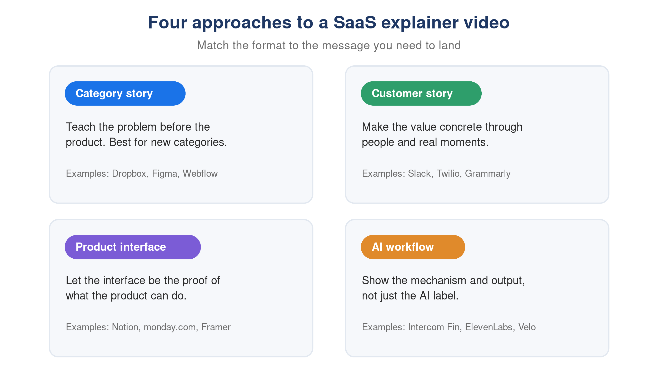
The 15 explainer video examples below take very different approaches. These B2B SaaS video examples include animation, customer stories, product launches, and videos that make the software interface the main character. For every example, we look beyond production quality and identify the strategic decision worth reusing.
What makes a good SaaS explainer video?
A strong SaaS explainer video communicates one product promise to one audience through one understandable story. It does not attempt to document the entire platform.
The best examples tend to do five things:
- Name a recognizable problem or desired outcome quickly.
- Show the product, result, or mechanism before attention fades.
- Connect features to a change in the user’s work.
- Match the visual format to what must be explained.
- End with one logical next action.
That does not mean every video must follow the same problem-solution script. A well-known product can open with a new capability. A category creator may need to teach the old problem first. A technical platform might begin by visualizing something buyers cannot normally see. The best software explainer video examples adapt their structure to the viewer’s existing knowledge.
Explainer videos are now the second most commonly created type of marketing video, made by 68% of video marketers (Wyzowl, 2026). The opportunity is therefore not simply to make one. It is to make one that gives the buyer useful clarity.
For a broader look at formats and applications beyond SaaS, see our guide to explainer video use cases, tips, and AI options. If you build for a software audience, our SaaS video overview covers where these videos fit across the funnel.
SaaS explainer video examples at a glance
| Example | Primary format | What it explains best | Main lesson |
|---|---|---|---|
| Dropbox | Simple animation | A new software category | Teach the problem before the interface |
| Figma | Illustration and UI | Collaborative design | Reframe accepted friction |
| Notion | Product UI walkthrough | A flexible workspace | Organize breadth around user outcomes |
| Webflow | UI and motion graphics | Visual web development | Translate technical power into visible control |
| Slack | Live-action story | Team communication | Let skepticism become the narrative |
| Twilio | Animated scenarios | Customer engagement infrastructure | Use concrete moments to explain a platform |
| Grammarly | Cross-device product demo | Writing assistance | Repeat one benefit across contexts |
| Intercom Fin | UI-led AI explainer | Automated customer support | Demonstrate the answer, not the AI label |
| monday.com | Product walkthrough | Multi-team work management | Show breadth through distinct users |
| ClickUp Chat | Feature launch video | Chat connected to work | Center the transformation |
| Framer | High-energy UI motion | Website design and publishing | Match craft to audience expectations |
| Lovable | Fast product launch | AI app creation | Make the pace prove the promise |
| ElevenLabs | Interface and sensory proof | Conversational AI | Give an invisible product something to experience |
| Claude | Minimal product story | AI work across devices | Let restraint create contrast |
| Velo | Real product workflow | Automated demo production | Show the differentiating mechanism |
Explainer videos that teach a new category or mental model
These examples do not begin by touring features. They first help viewers understand a different way of working.
1. Dropbox: explain the category before selling the product
Dropbox’s early animated explainer remains useful because it was created when cloud file synchronization was not yet obvious to most people. Simple drawings show the familiar frustration of moving, losing, and updating files before presenting a folder that stays available across devices.
Why it works: The video teaches a new mental model using an old problem the audience already understands. It avoids technical infrastructure and focuses on what disappears from the user’s life: emailing files to yourself, carrying storage devices, and wondering which version is current.
What to borrow: If your SaaS creates a category, spend more time clarifying the broken behavior than naming every component of your architecture.
2. Figma: challenge friction users have accepted
Figma explains collaborative design by contrasting it with fragmented tools, files, handoffs, and feedback. Minimal illustrations and interface moments make the alternative feel simpler without turning the video into a tutorial.
Why it works: The video does not ask viewers to care about browser-based design technology. It asks them to notice how much friction they have normalized. Collaboration becomes the story, and the product is the credible new default.
What to borrow: Frame your differentiator as the removal of an accepted inconvenience. Buyers understand “no more version confusion” faster than a technical description of real-time multiplayer infrastructure.
3. Notion: give a broad platform one organizing idea
Notion could easily overwhelm viewers with documents, databases, projects, wikis, calendars, and templates. Instead, its product explainer presents those surfaces as parts of one connected workspace and uses the real interface to show how different kinds of work fit together.
Why it works: The narration is approachable, while the UI provides evidence that the product can support the promised flexibility. Breadth is presented as coherence rather than as a long feature inventory.
What to borrow: When your SaaS serves several workflows, find the single idea connecting them. Use cases can change while the central product promise stays consistent.
4. Webflow: translate technical power into visible control
Webflow has to explain a difficult proposition: professional website development without writing code, but with control comparable to coding. The explainer combines interface footage, finished sites, and motion graphics rather than relying on a vague “no-code” claim.
Why it works: Viewers see both the building experience and its output. That closes the trust gap between “easy to use” and “capable enough for serious work.”
What to borrow: If buyers worry that simplicity means reduced power, show the control surface and the finished result together.
Explainer videos that turn product value into a story
These SaaS video examples use people, situations, or repeated moments to make the product promise feel concrete.
5. Slack: let the audience’s skepticism drive the plot
Slack’s live-action explainer follows a team trying the product rather than presenting an idealized list of collaboration features. The humor comes from recognizable workplace behavior and the team’s initial uncertainty.
Why it works: The viewer does not have to accept claims from a narrator. The characters ask the questions a skeptical prospect might ask and discover the value through use. Product proof is embedded in the story.
What to borrow: Build objections into the script. A credible before-and-after journey is often more persuasive than beginning with a perfectly enthusiastic customer.
6. Twilio: explain infrastructure through customer moments
Twilio’s platform is largely invisible to the end customer. Its explainer therefore focuses on recognizable interactions between businesses and customers rather than APIs, communication channels, and backend components.
Why it works: Individual scenarios make a large platform understandable. The viewer sees what orchestration looks like in real life: relevant communication arriving at the moment it is needed.
What to borrow: When your product works behind the scenes, tell the story from the point where its impact becomes visible. Then connect that outcome back to the platform.
7. Grammarly: repeat one promise across several contexts
Grammarly shows the product working across desktop, browser, and mobile writing situations. Although the contexts change, the benefit remains stable: helping people communicate more clearly while they write.
Why it works: Repetition creates understanding without feeling repetitive because each scene introduces a new environment. The product’s cross-platform reach becomes proof of usefulness, not a technical compatibility claim.
What to borrow: If your product works in many places, keep the message constant while changing the scenario. This is clearer than assigning a new claim to every scene.
8. Intercom Fin: demonstrate the quality of the answer
An “AI agent for customer service” can sound interchangeable with dozens of competing products. Intercom’s Fin video makes the proposition more concrete by focusing on the support work the agent can resolve and the experience it creates for customers and support teams.
Why it works: The product is judged through outputs and workflows, not through the repeated use of “AI-powered.” Showing the answer, the handoff, and the interface gives viewers something specific to evaluate.
What to borrow: For AI SaaS, demonstrate the behavior that differentiates the system. The model category matters less than the quality, reliability, or speed buyers can see.
SaaS product videos that make the interface the proof
When prospects need to see how a product works, animation should guide attention to the interface, not replace it.
9. monday.com: explain breadth through different users
monday.com serves teams with very different workflows. Its explainer moves through use cases and interface configurations, showing how the same platform can support planning, automation, dashboards, and collaboration.
Why it works: The product’s flexibility is demonstrated through distinct jobs rather than a generic claim that it is “customizable.” Each use case gives a different viewer an entry point.
What to borrow: If your platform is broad, organize the video by audience or job, not by navigation menu. Show enough UI to prove adaptability without teaching every setup step.
10. ClickUp Chat: center the before-and-after action
ClickUp’s feature explainer has a precise job: show why chat is more useful when it lives beside work. The video demonstrates messages turning into tasks, summarized threads, and answers drawn from the workspace.
Why it works: Every feature supports one transformation, from conversation that creates more coordination work to conversation that updates the work itself. The interface is visible, but the viewer is never asked to memorize it.
What to borrow: For a feature launch, define one behavioral change and make every scene prove it.
11. Framer: make the video meet the audience’s visual standard
Framer sells design software to people with strong visual judgment. Its high-energy product video uses polished UI motion, rapid transitions, and finished website output to communicate both capability and taste.
Why it works: The execution is part of the evidence. A poorly designed explainer would weaken the product claim even if the script were accurate.
What to borrow: Match production choices to what your audience evaluates professionally. Design tools must look designed, developer tools must feel technically credible, and enterprise tools must communicate control and reliability.
12. Lovable: make the pacing prove the product promise
Lovable promises that people can turn ideas into applications quickly. Its launch video moves at the same speed, combining UI interactions, generated output, kinetic type, and energetic sound design.
Why it works: The form reinforces the message. Viewers feel velocity before they have processed every capability. Crucially, real output appears alongside the visual effects, keeping the video anchored in product proof.
What to borrow: Let pacing express the benefit only when the product can substantiate it. Speed without evidence becomes noise.
Explainer video examples for AI and invisible systems
AI, automation, and infrastructure products often need to visualize actions users cannot directly observe. These examples show three different solutions.
13. ElevenLabs: let the product create the sensory proof
Conversational AI is difficult to explain visually because much of the value must be heard in the interaction. ElevenLabs combines interface moments, confident delivery, and voice output so the medium itself demonstrates the product.
Why it works: The explainer does not treat sound as background decoration. Voice quality and variety become product evidence, while the UI establishes that the capability is controllable software rather than a research concept.
What to borrow: Identify how buyers experience your core value and make that experience central. Do not force an invisible product into generic stock animation if the video itself can demonstrate the outcome.
14. Claude: use restraint when the category is noisy
Many AI launch videos compete through faster edits, louder claims, and longer capability lists. Claude takes a calmer approach, using warm minimalism and a focused product story to show work moving across devices and contexts.
Why it works: Restraint creates contrast. The product feels considered rather than chaotic, and the viewer has time to understand the central idea.
What to borrow: Match energy to positioning, not to category fashion. A quiet video can stand out when every competitor is shouting, provided the idea is strong enough to hold attention.
15. Velo: show the mechanism behind the differentiator
Disclosure: This article is published by Velo.
Velo’s browser-agent video explains a specific product promise: a team can demonstrate a workflow once, then let a video agent navigate the product and produce the finished video. The explainer shows the product and the resulting demo instead of describing generic “AI video creation.”
Why it works: The differentiating mechanism is visible. Viewers can understand what the agent does, where automation enters the process, and what it produces.
What to borrow: If your claim sounds similar to competitors, show the mechanism that makes it true. A concrete workflow is more defensible than a larger adjective.
What these SaaS explainer video examples have in common
The visual styles vary, but the strategic patterns are consistent.
They choose a message before choosing a style. Animation, live action, UI motion, and AI production are delivery methods. Start with the belief the viewer must leave with. A beautiful animated explainer video cannot rescue a script built around six unrelated promises.
They show evidence appropriate to the claim. Figma and monday.com show their interfaces. Slack shows people adopting a new way to communicate. ElevenLabs lets viewers hear the output. The evidence changes because the claim changes.
They compress the story, not the clarity. Short does not mean rushed. It means removing context the viewer does not need yet. Detailed implementation, secondary personas, settings, and exceptions can live in a product demo video or follow-up content.
They create one next step. A homepage explainer may lead to a signup or demo. A feature-launch video may lead existing customers to try the feature. Avoid stacking “book a call,” “start free,” “read the guide,” and “subscribe” into one closing scene.
Explainer video vs. product demo: which one do you need?
An explainer and a demo can overlap, but they answer different questions.
| Format | Main question | Typical content | Best placement |
|---|---|---|---|
| SaaS explainer video | Why should I care, and how does this work at a high level? | Problem, product promise, selected proof, CTA | Homepage, campaign landing page, sales introduction |
| Product demo video | Can this product handle my workflow? | Real interface, steps, use case, outcome | Product page, sales follow-up, evaluation, onboarding |
| Feature launch video | What changed, and why should I use it? | New capability, workflow change, result | Changelog, email, social, in-app announcement |
| Tutorial video | How do I complete this task? | Detailed steps and troubleshooting | Help center, onboarding, customer education |
If the audience does not understand the value, begin with an explainer. If they understand the value but need proof, show a demo. See the full breakdown of product videos vs. explainer videos, or study these product demo types, scripts, and examples for more UI-led references.
How to make a SaaS explainer video
Effective SaaS explainer video production begins with the buyer’s unanswered question, not with animation style or editing software.
1. Define the viewer and the next decision
“Prospects” is too broad. Decide whether the video is for a founder comparing tools, an operations leader building a business case, a product manager evaluating workflow fit, or an existing customer considering a feature.
Then choose the next decision: understand the category, continue exploring, start a trial, book a demo, or adopt the feature.
2. Write one product promise
Complete this sentence: For [specific viewer] who struggles with [problem], [product] makes it possible to [valuable outcome] by [credible mechanism].
If the sentence requires several “and” clauses, the video probably needs a narrower scope.
3. Choose the evidence
Ask what a skeptical viewer would need to see:
- The interface completing a workflow
- A before-and-after process
- A generated output
- A customer or employee using the product
- An animation of an invisible system
- A measurable result with proper context
Choose the format from the proof the buyer needs. Do not select character animation merely because another SaaS brand used it successfully.
4. Use a simple explainer video script
A practical SaaS explainer video script can follow five beats:
- Recognition: State the situation or problem in the viewer’s language.
- Change: Introduce the outcome your product enables.
- Mechanism: Show the essential way the product creates that outcome.
- Proof: Demonstrate the interface, output, scenario, or evidence.
- Action: Give the viewer one appropriate next step.
This is a framework, not a fill-in-the-blanks formula. Slack spends more time on the situation, ClickUp reaches the feature quickly, and Dropbox teaches the mental model. Change the emphasis according to what the audience already knows.
5. Build the first version around the real product
For software, a rough screen recording is often the fastest way to test the story. Record the intended workflow, then remove every action that does not support the main promise.
If the interface is the proof, Velo can turn a rough screen recording into a polished product video with guided zooms, a smoother cursor, clean cuts, captions, and brand styling. Its video agent can also reproduce an approved workflow without requiring another manual take.
Animation remains the better choice when the central idea is conceptual, emotional, or invisible. Many effective SaaS explainers combine both: animation for context and real UI for credibility.
6. Test understanding before polishing
Show a rough cut to someone who matches the audience but has not heard the internal pitch. Ask three questions:
- What problem does this product solve?
- How does it create the result?
- What would you do after watching?
If the answers are inconsistent, revise the story before investing in more motion, music, or visual effects.
How long should a SaaS explainer video be?
Explainer video length should follow placement and viewer intent. For a homepage or top-of-funnel landing page, 60 to 90 seconds is a useful starting range, not a universal rule. Wyzowl’s 2026 research found that 71% of marketers consider videos between 30 seconds and 2 minutes the most effective, while Wistia reports that videos under one minute average a 52% engagement rate, meaning viewers watch about half of the runtime.
Match runtime to intent:
| Placement | Starting length | What to include |
|---|---|---|
| Paid social or short campaign ad | 15 to 30 seconds | One problem, one differentiator, one action |
| Homepage or landing-page explainer | 60 to 90 seconds | Problem, promise, selected proof, CTA |
| Feature launch | 45 to 90 seconds | What changed, workflow, benefit |
| Sales follow-up or product-page overview | 1 to 3 minutes | Relevant use case and stronger product proof |
| Tutorial or onboarding | As long as the task requires | Complete steps, split by task where possible |
The question is not “How much can we fit?” It is “How much does this viewer need before taking the next step?”
Common SaaS explainer video mistakes
Opening with company history. Unless the origin story explains the buyer’s problem, begin where the viewer already has attention: their situation, desired outcome, or the product in action.
Showing every feature. A feature inventory produces shallow coverage and weak recall. Choose the smallest group of capabilities required to prove the central promise.
Hiding the product behind generic animation. Abstract motion can create interest, but software buyers often need to see what they are evaluating. Include the real interface when usability, workflow, or output quality is part of the decision.
Writing for a document instead of the ear. Voiceover needs shorter sentences and simpler transitions than a landing page. Read the script aloud and remove phrases that sound unnatural when spoken.
Treating the final render as permanent. SaaS interfaces and positioning change. Keep the source, script, voice, and project editable. Assign someone to review the video after major releases so the product proof does not become evidence of an outdated experience.
Frequently asked questions
What is a SaaS explainer video?
A SaaS explainer video is a short video that helps a specific audience understand a software product, problem, feature, or workflow. It usually combines a clear product promise with selected proof such as interface footage, animation, customer scenarios, or generated output.
What makes a good software explainer video?
A good software explainer video focuses on one audience and outcome, shows credible product evidence, uses plain language, removes secondary details, and ends with one next action. Its visual style supports the explanation instead of competing with it.
Should a SaaS explainer video be animated?
Not necessarily. Animation works well for new categories, invisible systems, and conceptual stories. The best animated explainer video examples use motion to reveal logic, not merely to decorate the script. Real product UI is stronger when buyers need to evaluate a workflow or output, while a hybrid can use animation for context and interface footage for proof.
Can AI create an explainer video?
Yes. An AI explainer video maker can help write a script, generate a voiceover, clean up a screen recording, add captions, and assemble a first cut. Human review is still necessary for product accuracy, positioning, brand judgment, and claims.
Where should you use an explainer video?
Common placements include the homepage, product and campaign landing pages, paid social, launch emails, sales outreach, pitch decks, events, and app marketplaces. Adapt the opening, length, and CTA to the viewer’s context rather than distributing one identical cut everywhere.
How is an explainer video different from a tutorial?
An explainer gives the viewer a high-level understanding of a problem, product, or feature and motivates a next step. A tutorial provides the detailed instructions required to complete a task. An explainer may show the workflow without teaching every click.
Build the story around what buyers need to believe
The best SaaS explainer video is not necessarily the most expensive, animated, or energetic. It is the one that identifies the buyer’s unanswered question and supplies the clearest credible evidence.
Start with one audience, one promise, and one next action. Decide whether that promise is best proven through a story, animation, product interface, generated output, or a combination. Then use the 15 examples above as references for specific decisions, not as templates to copy.
If showing the real product is central to your explanation, Velo can turn a recording, script, or approved workflow into a polished product video that is easy to update as the software changes. Book a demo to see it on your own product.